I spearheaded a ground-up overhaul of CoinDesk’s digital experience, aligning user needs with business goals and enabling long-term scalability.
Role.
Product strategy
Design leadership
Design vision
End-to-end visuals
Team.
Product Design
Product Management
Engineering
QA
Duration.
18 months (projected)
~7 months (delivered)
scale or fail


CoinDesk is one of the most trusted crypto news media brands in the world. However, the site’s legacy site was unsustainable, the CMS was inefficient, and the UX neglected — resulting in declining traffic, engagement, and revenue.
→ Users: Users were disengaged and frequently frustrated with the site experience. Their needs were constantly deprioritized, trailing behind business verticals' and advertisers' wants and demands. In an attempt to offset declining ad revenue, the habit was to overload the site with more ads, ultimately tanking engagement and traffic even lower.
→ Design: The site's designs had gone years without updates due to shifting business priorities diverting resources. This led to a fragmented user experience, driven by a lack of cohesive design leadership. Meanwhile, the design system had long been abandoned on the engineering side as a result of these challanges.
How might we create a scalable platform that supports evolving user needs?
I led the design team through a holistic redesign of the site experience and all associated CMS page templates, grounding every decision in a deep understanding of our user groups and their core jobs to be done. We also prioritized scalability—ensuring that our design solutions could evolve with the business, support rapid content creation, and stay consistent across an expanding ecosystem.
supervised_user_circle
As a leader, I…
Led a distributed team of remote in-house designers and contractors
Set strategy with the VPs of Product and Engineering
Defined and championed a compelling design vision across the organization
Partnered with the Product Director to navigate complex stakeholder dynamics and drive alignment
account_circle
As a contributor, I…
Investigated internal and external pain points through user and stakeholder research
Conducted competitive analysis to inform design decisions
Established new typographic styles, color systems, and layout grids
Designed the majority of UI components and page templates
Before diving into solutions, we needed a clear, shared understanding of the problems. Through stakeholder interviews, user research, audits, and analytics, we uncovered critical gaps in usability, content strategy, accessibility, and technical scalability. The site was trying to serve too many goals at once—resulting in a fragmented user experience, inefficiencies for internal teams, and missed opportunities to deliver real value. Our goal in discovery was to align on user needs, business priorities, and the foundational issues we had to solve before moving into design.
User feedback and ad density
User needs were consistently deprioritized, trailing behind business verticals and advertiser demands. In an attempt to offset declining ad revenue, the solution was to overload the site with more ads, ultimately tanking engagement and traffic even lower.
Internally, we had a social media Slack channel that was often referencing customer pain points such as these. It was clear that our ad density and frequency was hurting the experience.

A few of many actual tweets from frustrated users.
User group conflicts
By combining tools for both retail traders and institutional investors, the site created a mixed user experience that lacked clarity and focus for either audience. Most of this was due to competing business verticals trying to direct attention to their given piece of the site experience. Pages lacked a holistic experience, very piecemeal with irrelevant content being promoted throughout - an everything for everyone approach that failed to fully support the needs of any one user group.

Original price page layout, containing a tangled mix of retail and institutional tools.
Site content
Content pages were primarily designed to meet business needs rather than supporting users’ actual goals or jobs to be done. The experience felt disjointed, with scattered content from unrelated verticals resulting in an “everything for everyone” approach that served no one particularly well.
Hotjar scroll-depth data revealed that most users dropped off after key sections—such as the top headlines on the homepage or the chart on price pages—indicating a lack of sustained engagement.
As mentioned by our users, the site suffered from dense ad placement, which was both ineffective and disruptive to the user experience.
Adding to the inconsistency, pages alternated randomly between dark and light themes, further diminishing cohesion.

Previous site experience with in-house ads obstructing content and taking up nearly 50% of the viewport. Only a few words of actual content are visible upon load.
Masthead
The masthead was overly complex, spanning 4 to 6 layers deep and lacking a clear information architecture, which made navigation difficult and confusing.
On mobile, the sticky nav obstructed a sizable portion of the screen, further impacting usability.
Hotjar data revealed almost no engagement with the navigation, suggesting users were either overwhelmed or not finding value.
Marketing frequently misused the yellow alert bar to promote events that failed to convert.
The 'Search' function, when closed, triggered an intrusive Outbrain ad takeover that felt hijacking and generated negligible revenue.
On desktop, a large hover menu was easily triggered by accident, consumed most of the screen, and was difficult to dismiss, all contributing to a frustrating user experience.

Previous site's mobile masthead.

Previous site's mobile hamburger menu.
Grid
The grid system capped content at 1280px wide, despite Google Analytics showing most desktop users were on 1920px screens. This constraint pushed valuable content far below the fold, impacting visibility and engagement.
Additionally, the fluid grid between breakpoints led to layout issues, especially when paired with fixed-size ads, resulting in unpredictable and often broken designs.

(Left) A snapshot of GA4 user screen resolutions, identifying the top five desktop user viewport sizes range from 2560px to 1366px. (Right) A snapshot of our previous grid system documentation, not supporting viewports beyond 1279px.
Font Stack
The primary typeface, Roslindale—an obscure old-style display font—was used across various headline sizes, which negatively impacted legibility and scan-ability. It lacked support for multilingual character sets required for planned translations and had a licensing contract no one on the team fully understood. Internally, it was widely disliked.
The secondary font, Neue Haas Grotesque, also had significant limitations: it didn’t support all multilingual characters, lacked monospaced numerals crucial for our data-driven content, and its upcoming license renewal would cost over $80,000 for just three more years of use.

Roslindale was previously used as a primary headline font across the site. Neue Haas Grotesk was previously used as a secondary body font across the site.
Product and Design partnered closely to establish a set of guiding principles rooted in key opportunity areas—balancing user needs with business objectives. These principles became our north star, helping align cross-functional teams and streamline decision-making. Each was translated into concrete product requirements that shaped scope, prioritized efforts, and ensured focused, strategic execution across the redesign.
How might we create a scalable platform that supports evolving user needs?
face_4
Users First
Guiding Principle
Shift focus away from unsustainable revenue models and fragmented internal priorities. Instead, center decisions on user needs, grounded in research-driven insights and feedback.
Product Requirements
Reduce ad density to improve the site experience and faster load times, as measured by Core Web Vitals.
Improve accessibility across the site experience and media types, including articles and video.
Expand user inclusivity by offering multi-language translations to meet the diverse needs of our audience.
devices
Mobile First
Guiding Principle
Prioritize mobile-first design to align with user behavior, shifting the focus from revenue-driven desktop models to the platforms where users are most engaged.
Product Requirements
Increase readable content above the fold, with a particular focus on mobile devices.
Improve accessibility through touch-friendly design to enhance mobile user experience.
mediation
Simplification
Guiding Principle
Streamline the platform and site experience to reduce complexity, enhance consistency, and eliminate friction for both users and internal teams.
Product Requirements
Simplify CMS templates to improve the reading experience.
Reduce CMS template types to improve the editorial experience and time-to-publication.
Streamline site navigation to increase user engagement and focus.
To improve several business-critical page types, Product and Design partnered with stakeholders across CoinDesk’s many verticals to holistically redefine each page’s core purpose. This alignment helped shift away from a one-size-fits-all model toward focused, purpose-driven experiences grounded in both user needs and business goals.

A stakeholder workshop was ran to align on the homepage’s core purpose—revealing a strong consensus around driving user engagement over serving scattered, competing business priorities.
Approach
The product and design teams began by auditing and evaluating the performance and JTBD across all CMS-driven page types to better understand their role in the overall experience. From there, we categorized each page into one of four strategic buckets:
Create : for pages requiring a full redesign
Clean : for those needing only minor improvements
Convert : for pages that could be migrated as-is, and
Kill : for pages that no longer served a purpose and could be removed entirely.
This approach ensured a scalable, intentional redesign strategy grounded in performance and purpose.

A Google Sheets set up to conduct a full site audit on pages and page groupings, as well as components, their frequency and where they are used across pages.
Competitive Analysis
CoinDesk operated in a crowded and rapidly evolving crypto landscape, competing across multiple verticals—from news and data to indices and events. As part of our research, we conducted a comprehensive competitive analysis to identify emerging patterns and shared conventions shaping user expectations.
Across many of these platforms, we observed consistent UX standards—clear navigation, streamlined data presentation, responsive design, etc.—that had become baseline expectations. CoinDesk, by contrast, often deviated from these norms, creating friction for users and missing key opportunities to establish credibility and clarity. These insights helped shape our strategy, not to imitate, but to close critical gaps and reimagine a more focused, differentiated experience that still met core user expectations.
However, one clear differentiator stood out: CoinDesk’s reputation for trusted, high-quality journalism—a rare thing in the crypto space. We saw an opportunity to lean into our editorial authority as a way to build deeper user trust and long-term engagement.
Ideations
After determining which pages were considered critical enough to place into the Create or Clean strategic categories, the design and product management teams began iterating on the new goals and requirements for those individual experiences. Often, this would entail several rounds of sketches and wireframe iterations to strike a balance between what delivered on user and business expectations and what was feasible within our roadmap's scope.

Sketched ideations conducted with Product Managers for our re-envisioning of the Price Page.

Rough designs in Figjam, outlining core functions and their mapping to the product.

Homepage v1 wireframe in a dense content model.

Homepage v2 wireframe in a linear content model.
To avoid engineering bottlenecks, we adopted a page-by-page handoff approach. To ensure a cohesive experience while building the Design System in parallel, I strategically split responsibilities with my design direct report: I focused on designing new (“Create/Clean”) layouts, while they led the componentization effort. Once the system matured, we both shifted to template-based layout design. As the scalable component library grew page by page, design velocity increased—ultimately enabling us to deliver what was originally scoped as sixteen months of work in just seven.
This phased, parallel approach allowed us to roll out consistent improvements across high-impact pages without sacrificing speed or quality. Below, you’ll find a breakdown of key page types—highlighting the legacy challenges we addressed and the specific UX enhancements introduced in the redesign.
Drag icons to reveal before/after images
swipe
Masthead
Before:
Multi-layered and dense
Confusing information architecture and ontology
Business-prioritized content overshadowed user needs
After:
Simplified and streamlined structure
Brand-led experience that reinforces identity
Clear, logical ontology
Elevated and relevant content based on user behavior patterns
cancel
check_circle
cancel
check_circle
cancel
check_circle
cancel
check_circle
Homepage
Before
Content duplications across modules
Fragmented content hierarchy
Forced business interests dictating layout
Content misaligned with user intent
High ad density disrupting experience
Shallow scroll depth
After
Streamlined and purposeful content structure
Intuitive, user-centered content hierarchy
Content aligned with actual user behaviors
Optimized ad placements for improved experience
~15% deeper scroll behavior indicating higher engagement
cancel
check_circle
Article
Before
Scattered, inconsistent layout
High ad density disrupted reading flow
Desktop-first design with reliance on side rails
Accessibility issues (e.g., poor link contrast)
After
Mobile-first design with streamlined layout (no side rails)
Standardized and limited ad placements for better readability
Accessibility improvements meeting WCAG AA or higher
Introduced “What to Know” summaries, increasing engagement
cancel
check_circle
Data Page
Before
Unconventional card format
No sorting capabilities for asset data
Difficult to compare assets side by side
Dark theme clashed with the site’s overall UX
Limited screen space for asset visibility
After
Standardized to industry norms with a table format
Improved data density for easier scanning
Added sortable columns to enable data exploration
Simplified asset comparison across rows
Unified light theme to align with the site’s UX
cancel
check_circle
Price Pages
Before
Unconventional format compared to industry standards
Mixed personas (retail vs. institutional) created a fragmented experience
High ad density disrupting content flow
Business-prioritized content misaligned with user needs
Dark theme inconsistent with broader site UX
After
Standardized layout to match industry norms
Better positioned affiliate ads for improved UX and monetization
Focused content strategy tailored to retail audiences
SEO optimizations to improve visibility and traffic
Leveraged CoinDesk’s editorial authority as a trust-building differentiator
Light theme adopted for a unified site experience
cancel
check_circle
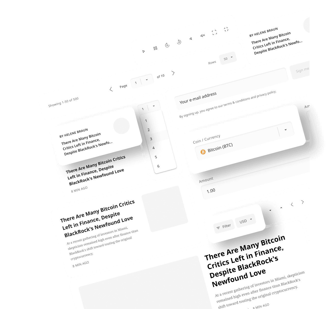
Video player
Before:
No support for closed captions
Tap targets too small and too close together
Poor contrast on UI elements, especially over light videos
No contextual information about the video
Autoplayed muted videos with low engagement
After
Added closed caption support for accessibility
Increased tap target size and spacing for better usability
Improved contrast of UI elements for readability
Introduced contextual information alongside videos
Large “Unmute” call-to-action increased engagement
cancel
check_circle
The impact of our redesign was both immediate and far-reaching. Navigational engagement jumped 133x, and international traffic surged by 70–120% week over week with each new language rollout. We saved $80K by replacing costly font licenses, while improving accessibility scores to 93% and boosting Core Web Vitals across all key pages. Search performance improved with a 21% lift in SERP click-through rates, and user satisfaction rose notably—evidenced by a measurable drop in negative feedback. Together, these results reflect a meaningful shift toward a more scalable, user-centered platform.
