I led the design strategy and execution to transform CNET’s commerce content into scalable, high-converting experiences across all CNET Media Group brands.
Role.
Product strategy
Design leadership
Design vision
End-to-end visuals
Team.
Product Design
Product Management
Duration.
3 months
best lists forever


CNET’s commerce model historically leaned on long-form product reviews with affiliate links. While this built trust around high-consideration products, audience behaviors were shifting, seeking quick, comparable recommendations, especially during high-volume seasons like the holidays.
→ Key UX issues included deep scroll fatigue and friction in decision-making due to buried product details.
→ Long-form “best lists” were inefficient to maintain and not optimized for conversion.
→ Editorial teams lacked standardization, leading to inconsistent user experiences and underperforming content.
How might we help users make confident purchase decisions quickly, while enabling editorial teams to publish and maintain best lists more efficiently?
We introduced a reusable listicle component with product superlatives, summaries, images, and merchant CTAs, paired with a top-of-page “precap” summary and anchored links, all maintained through a centralized CMS structure to enable rapid publishing, consistent formatting, and higher conversion.
supervised_user_circle
As a leader, I…
Proactively proposed new formats and best practices
Set strategy with the Product team
Defined and championed a compelling design vision
Led the design team on iterative optimizations and future product features
account_circle
As a contributor, I…
Investigated internal and external pain points through user and stakeholder research
Conducted competitive analysis to inform design decisions
Designed the initial UX that set the stage
CNET’s long-standing commerce model was built around in-depth product reviews with affiliate links. While this format worked well for high-consideration purchases, shifts in user behavior were becoming apparent.
User needs and habits
Research and analytics began to show a growing preference for quick, comparable recommendations, especially in high-traffic seasonal moments like the holidays. Users were less interested in reading full-length reviews for every product and more focused on skimmable advice they could trust and act on quickly.
Editorial efforts
Internally, editorial teams also faced challenges: producing long-form content required significant time and effort, and these pieces weren’t always easy to maintain or scale across similar pages. The question wasn’t just what users wanted—it was also about how to make it easier for teams to meet that need repeatedly and efficiently.
While CNET technically already had “best list” pages, these were essentially long-form articles repurposed into list formats, customized ad hoc by individual editors. This inconsistency created challenges for both the user experience and the editorial workflow. The structure lacked clear product comparisons, required deep scrolling, and didn’t guide users toward purchase decisions effectively.
From a maintenance standpoint, each list existed as its own isolated page, making updates time-consuming and reducing opportunities for content reuse. Further testing also revealed that users often bounced before getting to the most relevant product recommendations.
These pain points clarified the need: design a unified system that supported both editorial flexibility and user clarity, while also driving measurable outcomes for commerce.
How might we help users make confident purchase decisions quickly, while enabling editorial teams to publish and maintain best lists more efficiently?
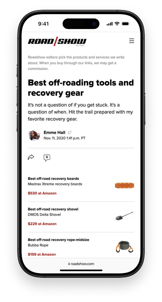
The "listicle"
We began by designing a modular listicle component: a compact, reusable block featuring a product’s superlative (like “Best Budget Pick”), image, title, summary, and merchant pricing links. Each module offered just enough information for the user to feel confident making a purchase, with optional links to read the full review for those who wanted more depth. These components could be centrally managed in the CMS, allowing them to be reused across multiple best lists and updated in one place.
"Precap" ideations
To further reduce scroll fatigue and surface value quickly, we created the “precap” — a condensed list of the top recommendations placed at the top of each best list page. After testing both horizontal card layouts and dense vertical lists, we found the latter performed best due to the number of products visible at once. To balance visibility with layout concerns, we added a “Show more” option after the fifth item and included “Jump to details” links beside each merchant CTA, letting users dive deeper into individual writeups further down the page.
Mobile precap cards wireframe prototype
Mobile precap list wireframe prototype
Publication best practices
Beyond the UI, we tackled editorial consistency. A lack of standards meant even the best-designed components could fall flat if misused. We collaborated with Product and Editorial to define and test a set of publishing best practices—guidelines covering content structure, module usage, and formatting. A/B testing showed that following these standards significantly improved conversion, which helped secure buy-in from editorial leadership.
The final system combined reusable listicle modules, a top-of-page precap, and a tested set of editorial guidelines. Implementation began with one of CNET’s most trafficked lists—Best TV Streaming for Cord Cutters—which was A/B tested using the new system.
The listicle
Once launched, the listicle format fundamentally transformed how CNET presented commerce content. With modular, reusable product components and a structured layout optimized for decision-making, the format enabled faster publishing, easier maintenance, and stronger monetization.

The precap
The Precap feature was integrated into the newly established listicle format and quickly demonstrated measurable impact. By surfacing a dense, scannable summary of top products at the top of the page, it addressed user fatigue and decision-making friction. After launch, the addition of the Precap drove a 40% increase in conversion compared to listicles without it. The “Jump to details” link further supported user confidence by offering a seamless path to deeper content when needed.


Scaling success
Following the format's validated versatility and effectiveness on CNET, it was quickly established as a shared framework for commerce-driven storytelling across the entire CNET Media Group portfolio. The new best list was rolled out across all sister properties including GameSpot, Roadshow, and ZDNet. Its modular architecture and clearly defined publishing standards made adoption seamless across teams with different audiences and editorial workflows.


The new system of modular listicles, precap summaries, and editorial best practices had a dramatic impact across CNET’s commerce experience.
Conversion rates increased significantly, with one A/B test showing a fourfold improvement after adopting the new format. Editorial teams were able to publish and update content faster thanks to centralized modules and streamlined workflows.
Consistency and quality improved site-wide, helping users feel more confident in their purchase decisions.
The scalable system also expanded beyond CNET, leading to widespread adoption across sister sites like ZDNet, where a restructured “Best of CES” list saw a staggering 1200% increase in clickthroughs. Overall, this work transformed how commerce content was created, maintained, and monetized across the CNET Media Group.